
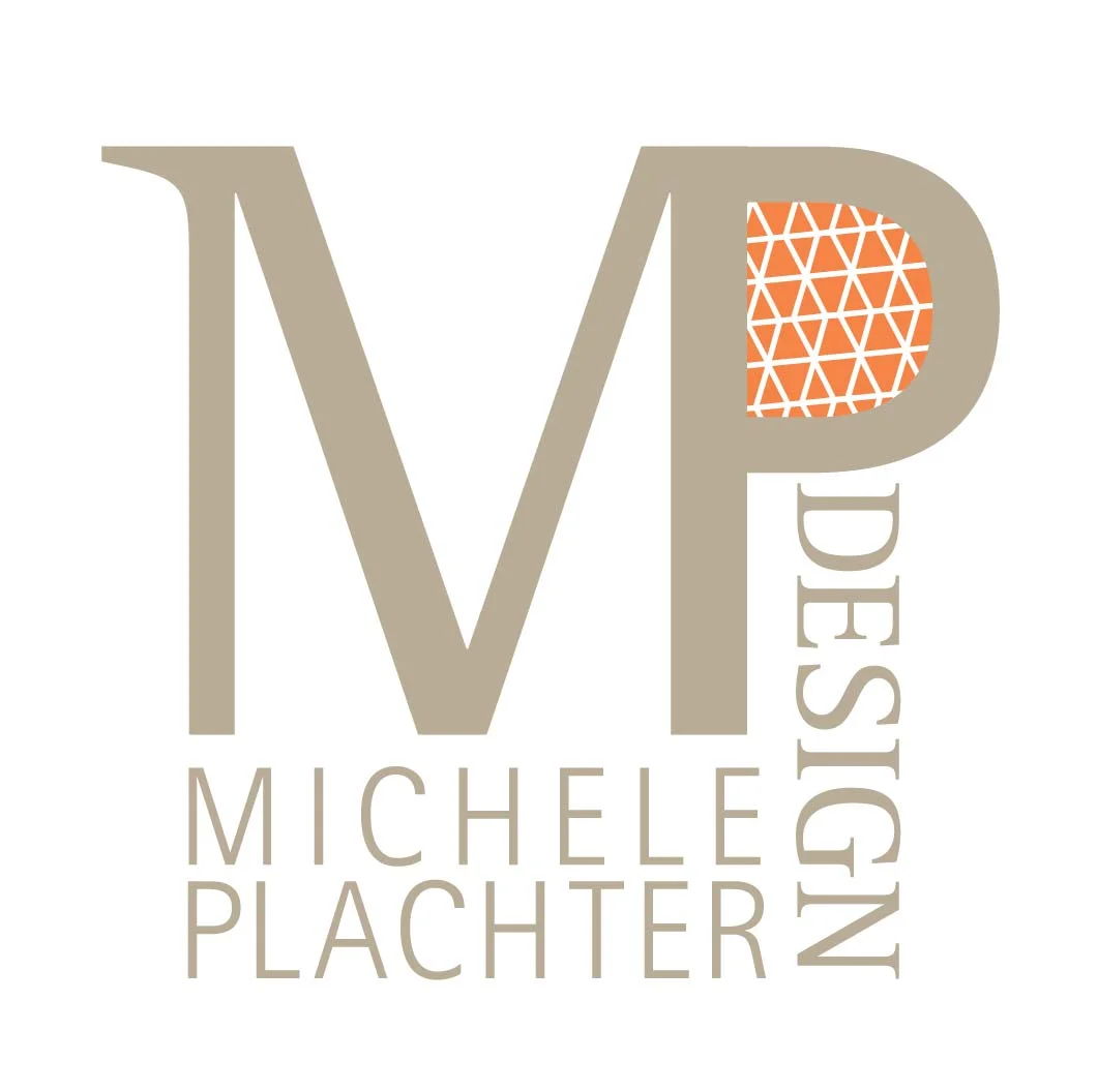
The logo represents the client’s interior design work. The structural feel of the stacked text represents the interiors she builds sometimes by scratch. The font choice represents the client’s modern, classical and vintage style she combines in her work combining serif, sans serif and half serif styles. The pattern in the center of the P is a graphic element pulled from a lamp in the client’s favorite interior design.
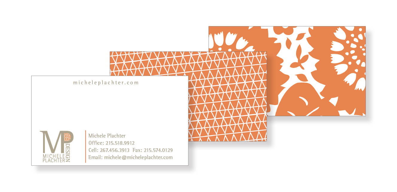
The patterns selected for the backs of the business cards were pulled from the client’s own interior design pieces. The client chose the ones she felt best represented her work.
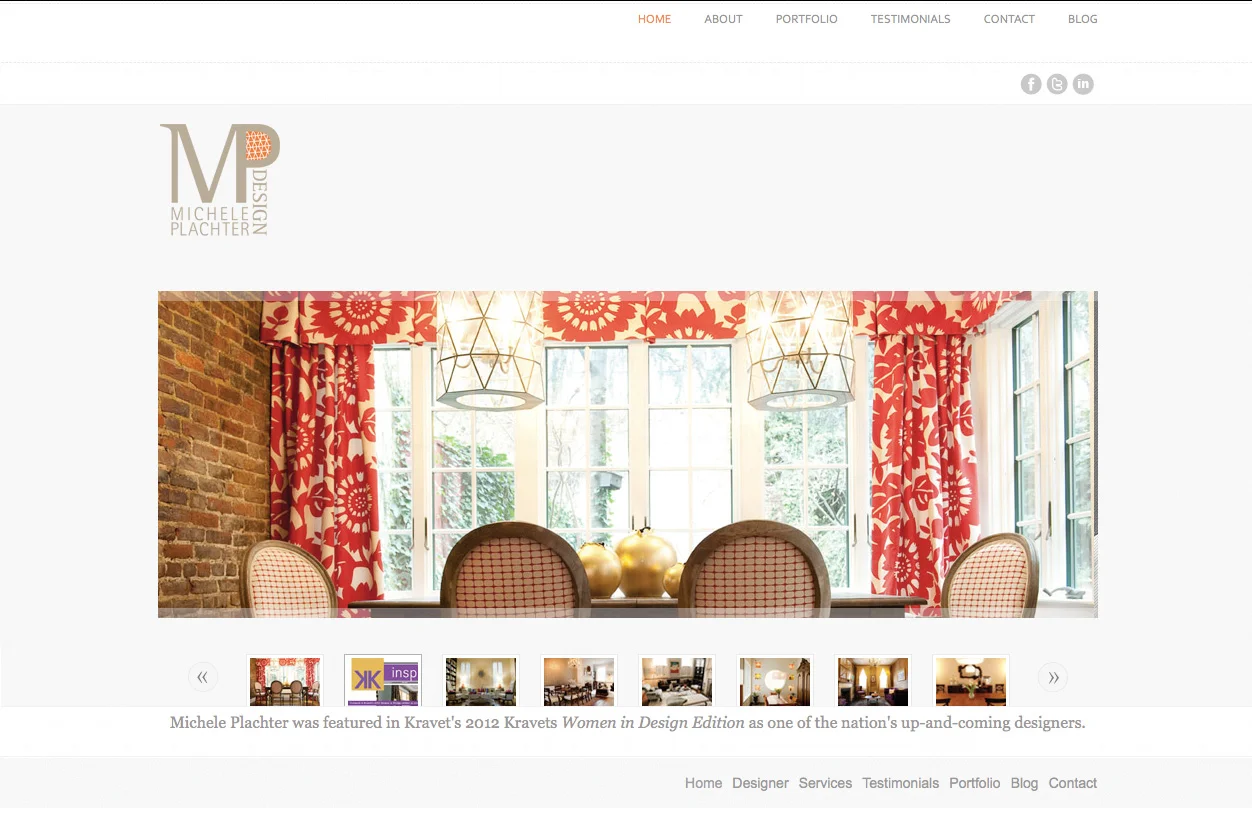
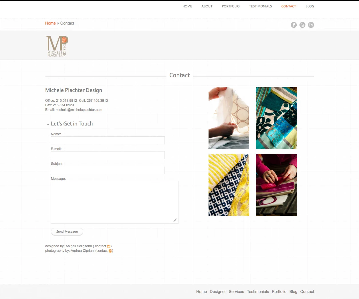
Reworked an existing template to provide a showcase for the client’s design portfolio.
Reworked an existing template to provide a showcase for the clients portfolio.